Click Wheel

Bring the joy of the iPod style click wheel back. A tactile React component for playback, volume, and everything you used to slide.

Start building
Morning Coffeestop
0:00 / 3:12

A dial or a wheel is a perfect example of good hardware design, it's timeless, simple and beautiful. From the Braun SK2 radio to Fellow kettles, coffee grinders, guitar amplifiers, and the iPod, the same idea keeps appearing: turn to explore a range, stop to make a choice.

It’s compact, tactile, and satisfying to use. Yet a control so familiar in physical products is surprisingly rare in digital interfaces. There may be good reasons for that, but I wanted to explore what it could feel like on a touchscreen. So here’s my take on bringing the wheel to mobile UI.
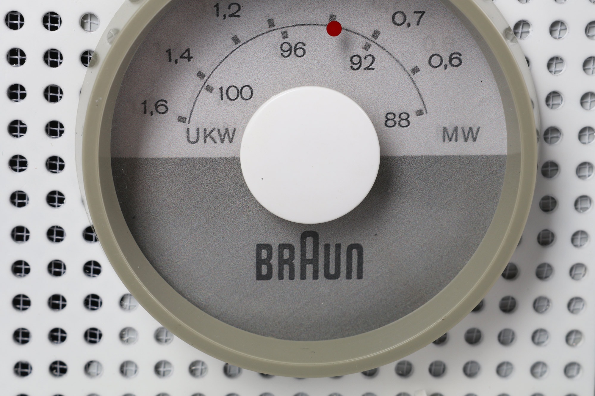
The tuning knob, frequency scale, and perforated grille of a Braun SK2 radio
Braun SK2. Interactive dial preview.

Drag around the dial, scroll, or use the arrow keys. Home and End select the limits.
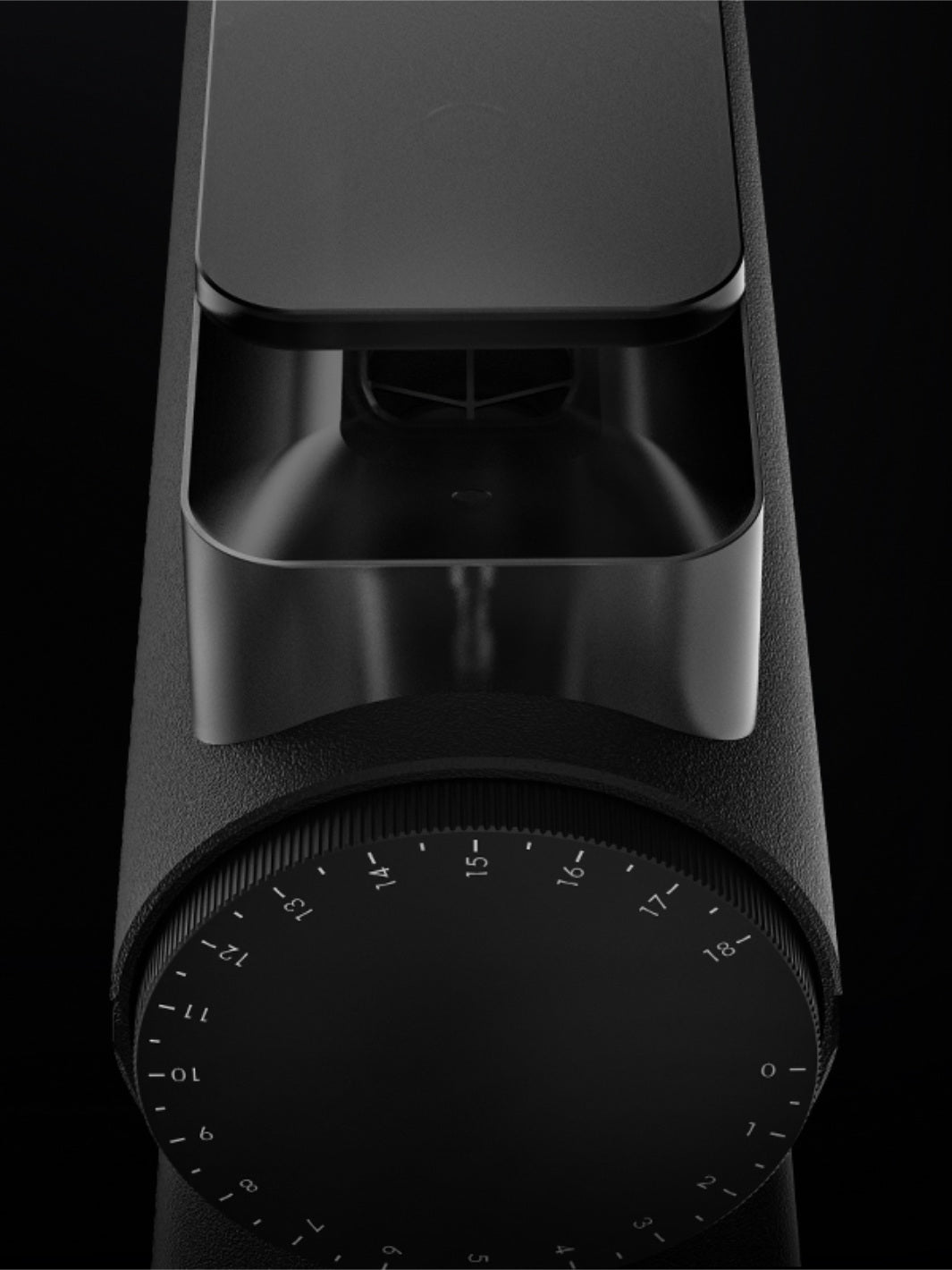
A close detail of the numbered grind adjustment dial on a black Timemore Sculptor
Timemore Sculptor. Interactive dial preview.

Drag around the dial, scroll, or use the arrow keys. Home and End select the limits.
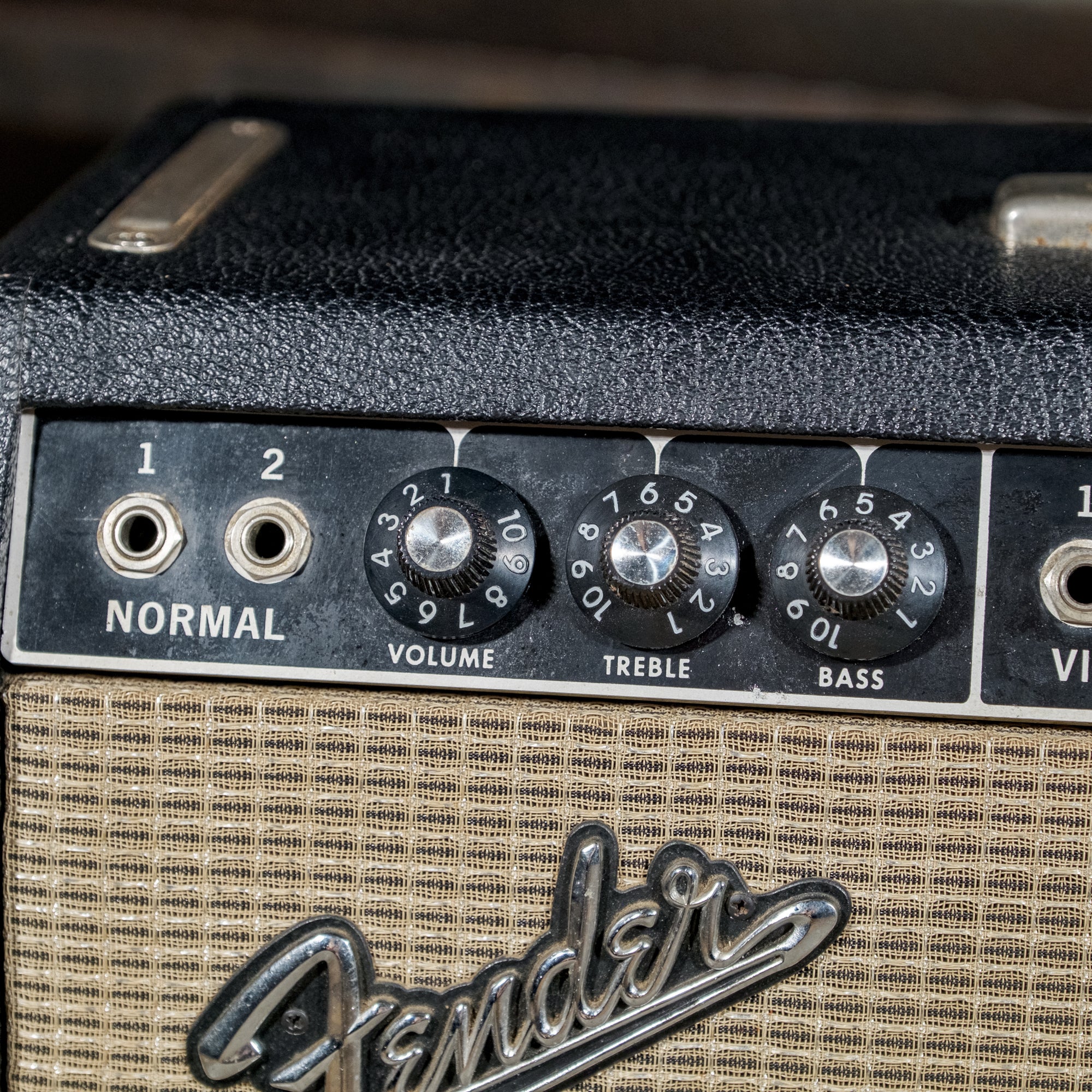
The silver-capped volume knob and numbered skirt on a vintage Fender Deluxe Reverb amplifier
Fender Deluxe Reverb. Interactive dial preview.

Drag around the dial, scroll, or use the arrow keys. Home and End select the limits.
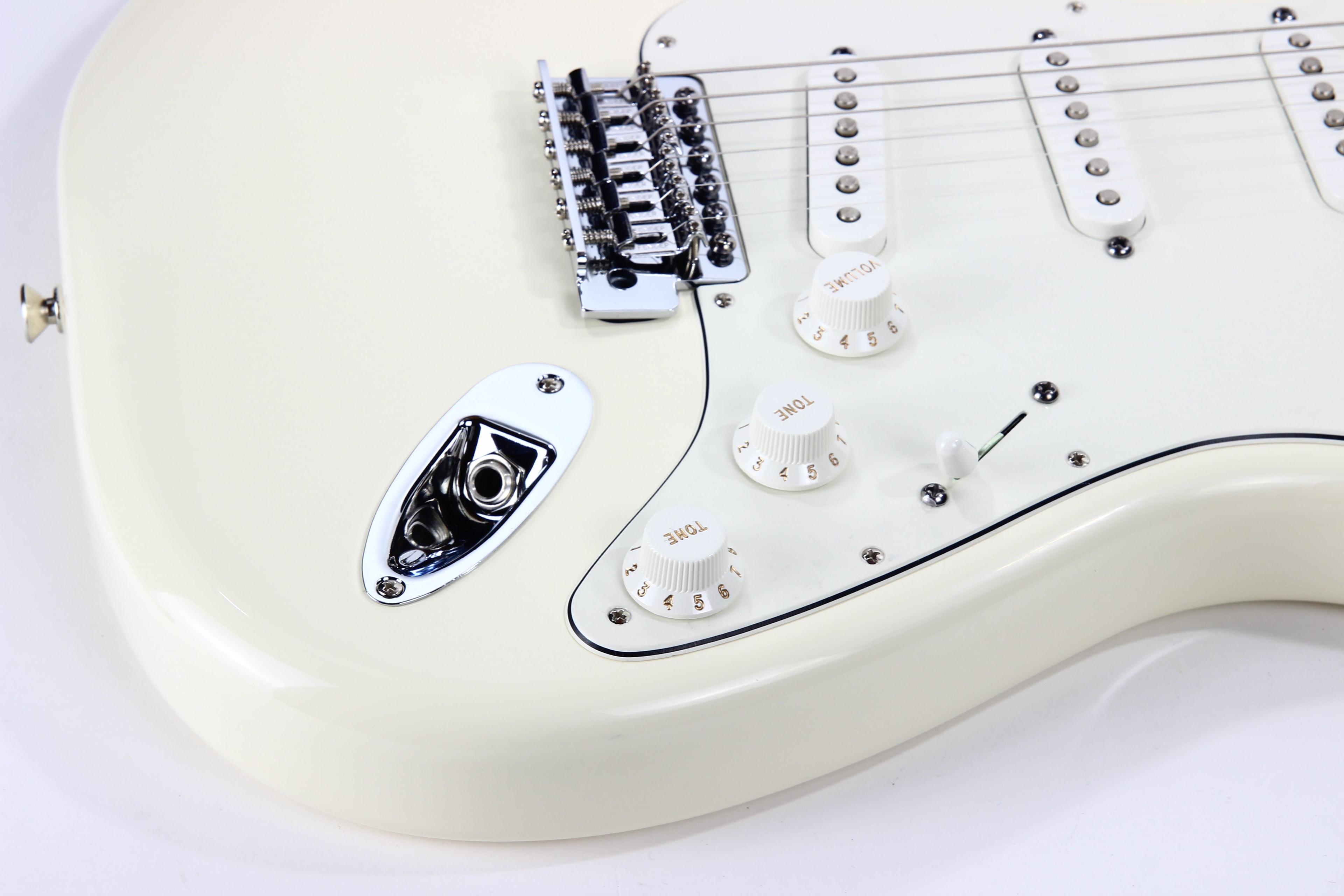
The ribbed white volume knob and gold numbers on a Fender Stratocaster
Fender Stratocaster. Interactive dial preview.

Drag around the dial, scroll, or use the arrow keys. Home and End select the limits.
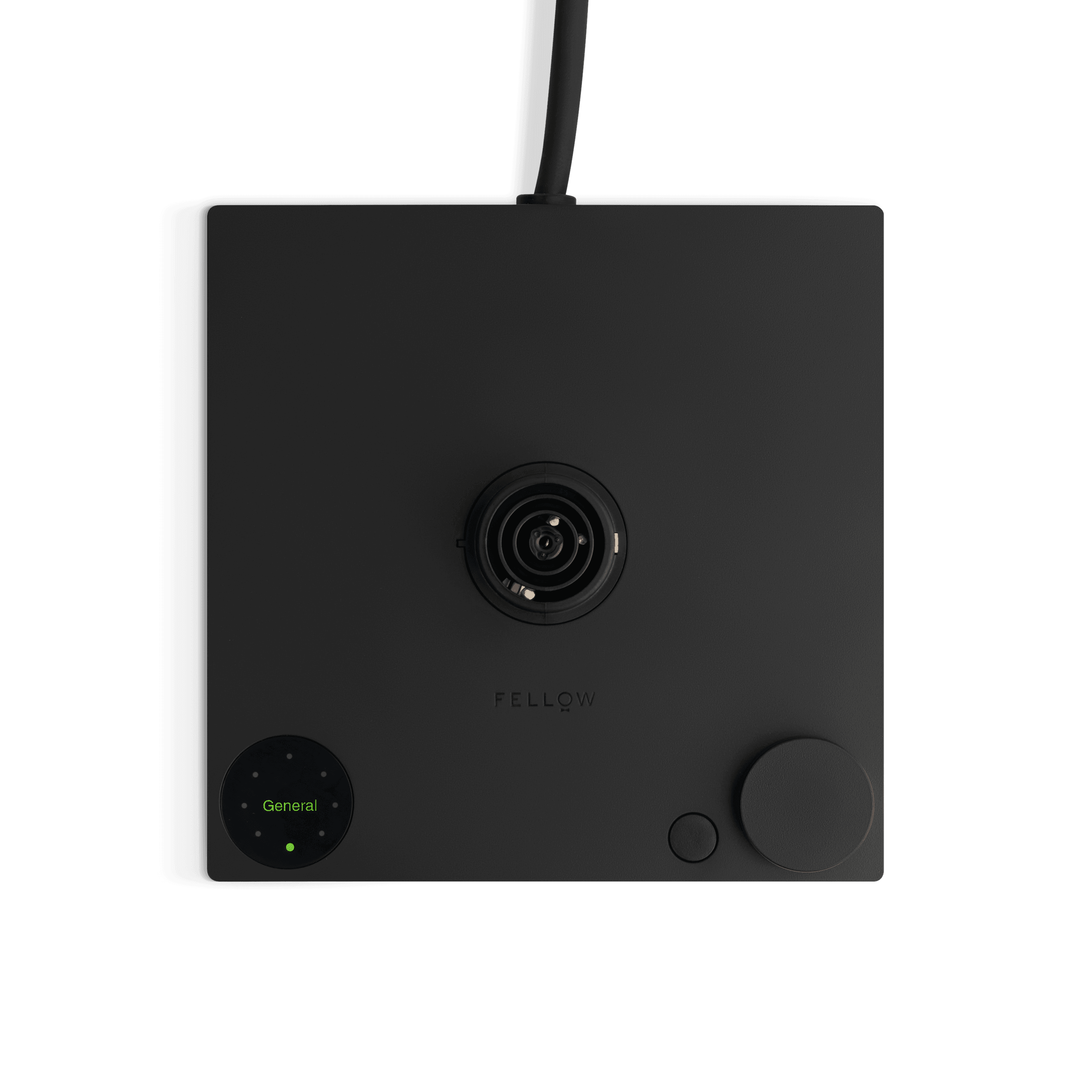
The temperature dial and menu button on a black Fellow Stagg EKG Pro base
Fellow Stagg EKG. Interactive dial preview.

Drag around the dial, scroll, or use the arrow keys. Home and End select the limits.
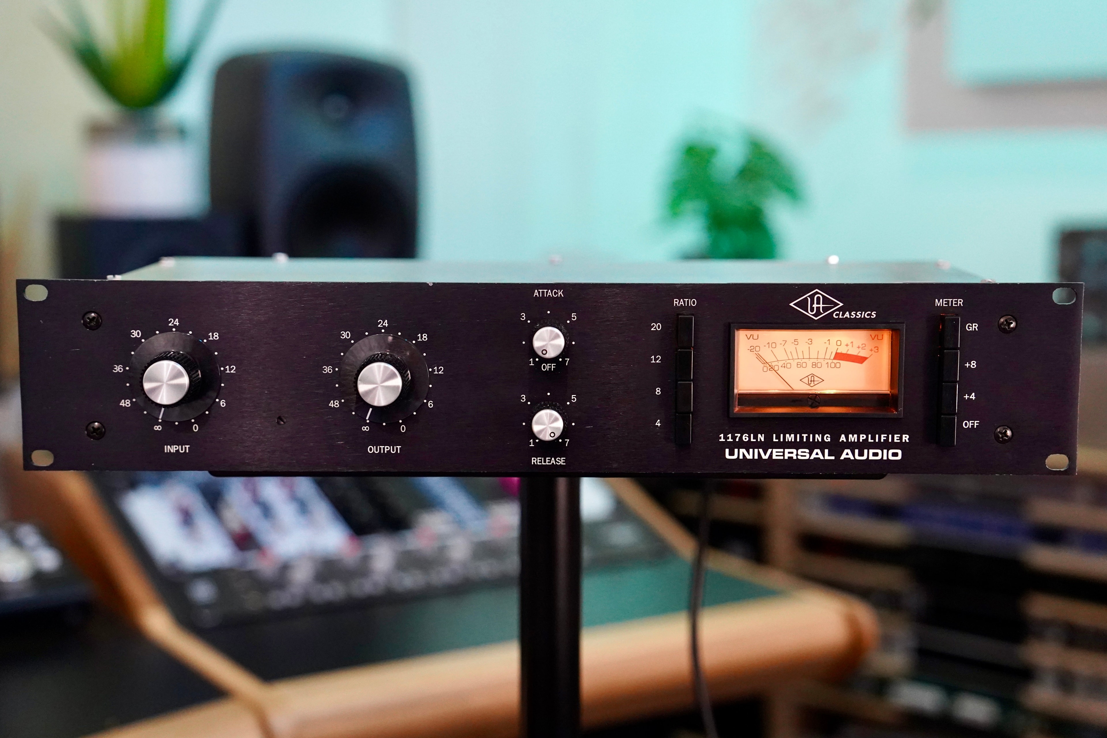
The silver input knob and white decibel scale of a Universal Audio 1176LN compressor
Universal Audio 1176LN. Interactive dial preview.

Drag around the dial, scroll, or use the arrow keys. Home and End select the limits.
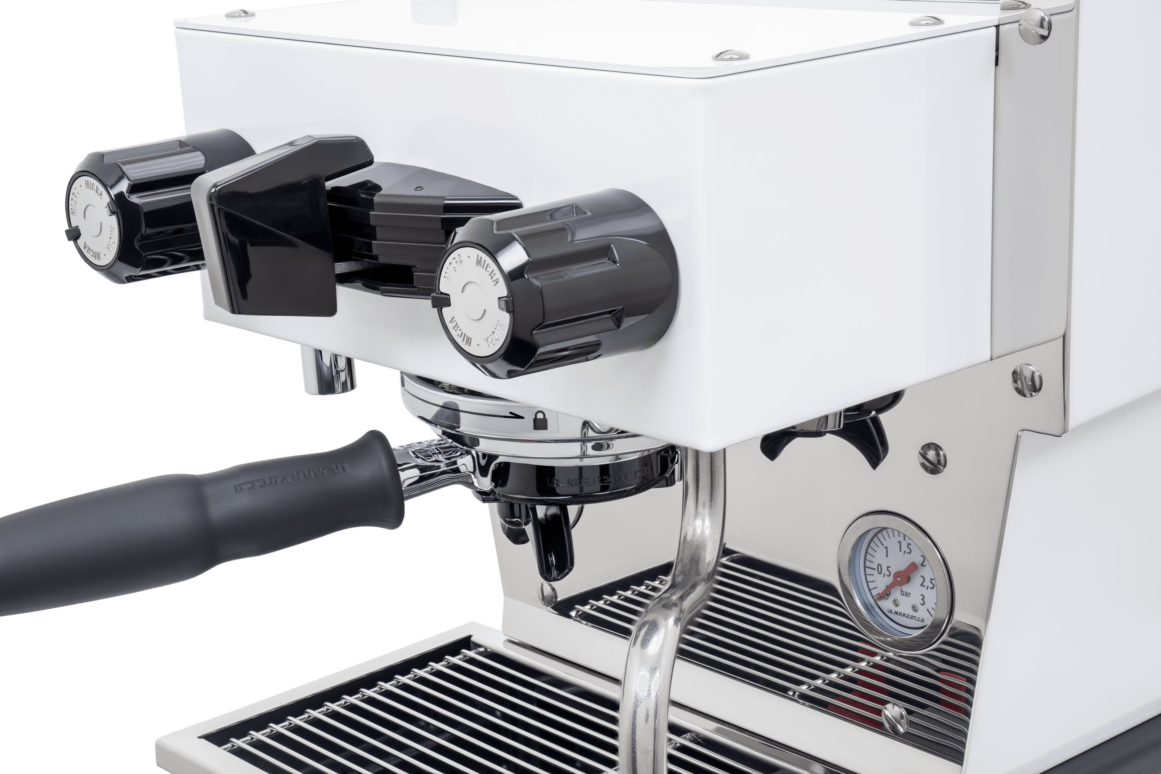
A close detail of the fluted steam knob on a white La Marzocco Linea Micra
La Marzocco Linea Micra. Interactive dial preview.

Drag around the dial, scroll, or use the arrow keys. Home and End select the limits.
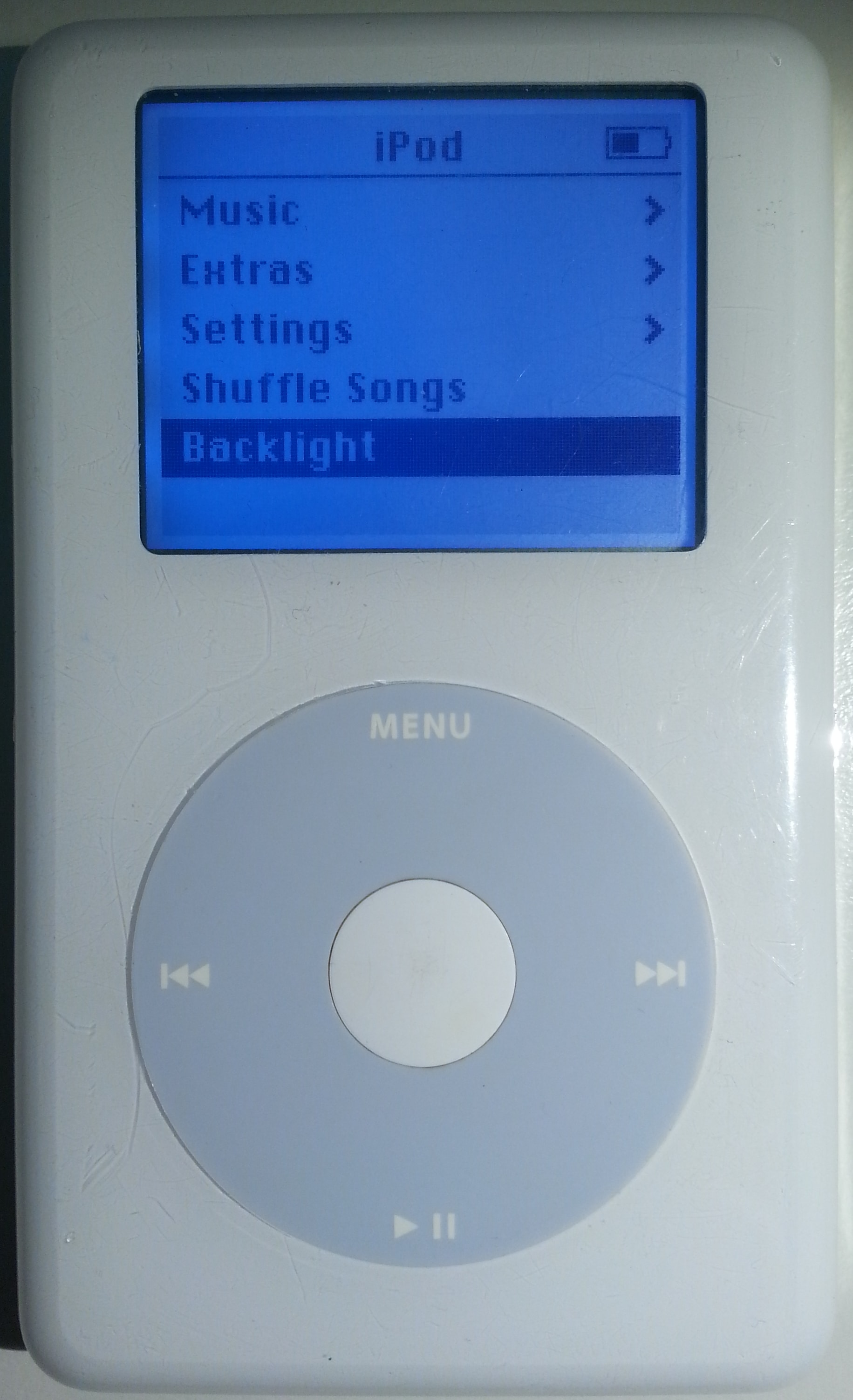
The gray Click Wheel, playback symbols, and white center button on a fourth-generation iPod
Apple iPod. Interactive dial preview.

Drag around the dial, scroll, or use the arrow keys. Home and End select the limits.
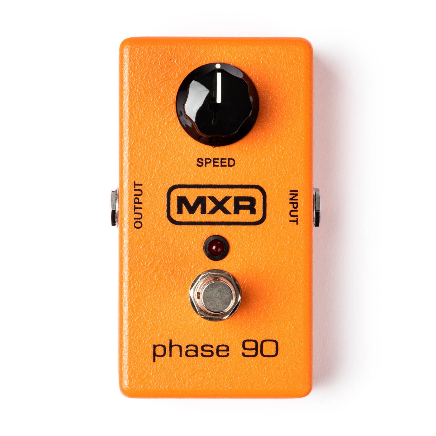
The black speed knob and MXR logo against the orange casing of a Phase 90 guitar pedal
MXR Phase 90. Interactive dial preview.

Drag around the dial, scroll, or use the arrow keys. Home and End select the limits.

Tap a photo to try the dial

Explore the themes
pnpm add click-wheel

Themes

Add a theme with the shadcn CLI, or copy its source. Each theme uses the click-wheel package.

0:003:12

Install with shadcn/ui

pnpm dlx shadcn@latest add https://click-wheel.jackymo.me/r/click-wheel-shadcn.json
themes/shadcn/wheel.tsx
"use client";

import * as React from "react";
import { ClickWheel } from "click-wheel";

const GROOVE = 4;
const MAX_GROOVES = 8;

export interface WheelProps extends Omit<ClickWheel.RootProps, "children" | "className"> {
  label: string;
  getAriaValueText?: (value: number) => string;
  icon?: React.ReactNode;
  onCenterClick?: () => void;
  centerLabel?: string;
  className?: string;
  grooves?: boolean;
}

export function Wheel({
  label,
  getAriaValueText,
  icon,
  onCenterClick,
  centerLabel,
  className,
  grooves: wantGrooves = false,
  min = 0,
  max = 100,
  unitsPerTurn = 100,
  ...rootProps
}: WheelProps) {
  const laps = Math.ceil((max - min) / unitsPerTurn - 1e-9);
  const grooves = wantGrooves && laps > 1 && laps <= MAX_GROOVES ? laps : 1;

  return (
    <ClickWheel.Root
      {...rootProps}
      min={min}
      max={max}
      unitsPerTurn={unitsPerTurn}
      className={`relative aspect-square ${className ?? ""}`}
    >
      {Array.from({ length: grooves }, (_, i) => (
        <div
          key={i}
          aria-hidden="true"
          className="absolute rounded-full [background:conic-gradient(var(--primary)_calc(var(--groove-fill)*360deg),var(--border)_0)] [mask:radial-gradient(circle_closest-side,transparent_calc(100%_-_3px),black_calc(100%_-_2px))]"
          style={
            {
              inset: i * GROOVE,
              "--groove-fill":
                grooves === 1
                  ? "var(--click-wheel-fraction)"
                  : `clamp(0, calc(var(--click-wheel-turns) - ${i}), 1)`,
            } as React.CSSProperties
          }
        />
      ))}
      <ClickWheel.Ring
        aria-label={label}
        getAriaValueText={getAriaValueText}
        style={{ inset: grooves * GROOVE + 4 }}
        className="absolute cursor-grab rounded-full border border-border bg-muted shadow-sm outline-none ring-offset-2 ring-offset-background focus-visible:ring-2 focus-visible:ring-ring data-[dragging]:cursor-grabbing data-[disabled]:cursor-default data-[disabled]:opacity-50"
      >
        <ClickWheel.Rotor className="absolute inset-0 rounded-full opacity-25 transition-opacity [background:repeating-conic-gradient(var(--ticks,var(--foreground))_0_1deg,transparent_1deg_15deg)] [mask:radial-gradient(circle_closest-side,transparent_56%,black_57%_82%,transparent_83%)] data-[dragging]:opacity-60 data-[coasting]:opacity-60" />
      </ClickWheel.Ring>
      <ClickWheel.Center
        aria-label={centerLabel}
        onClick={onCenterClick}
        className="absolute left-1/2 top-1/2 flex size-[38%] -translate-x-1/2 -translate-y-1/2 items-center justify-center rounded-full border border-border [background:var(--hub,var(--background))] [color:var(--hub-foreground,var(--foreground))] shadow-xs outline-none transition-transform active:scale-95 focus-visible:ring-2 focus-visible:ring-ring disabled:opacity-50 [&>svg]:size-[36%]"
      >
        {icon}
      </ClickWheel.Center>
    </ClickWheel.Root>
  );
}
globals.css
.theme-navy-orange {
  --duo-primary: #12354e;
  --duo-secondary: #f99d1b;
}

.theme-indigo-coral {
  --duo-primary: #051230;
  --duo-secondary: #f48067;
}

.theme-russet-sea {
  --duo-primary: #793327;
  --duo-secondary: #00b49b;
}

.theme-plum-cinnamon {
  --duo-primary: #4e1d4c;
  --duo-secondary: #c27544;
}

.theme-navy-orange,
.theme-indigo-coral,
.theme-russet-sea,
.theme-plum-cinnamon,
.dark .theme-navy-orange,
.dark .theme-indigo-coral,
.dark .theme-russet-sea,
.dark .theme-plum-cinnamon {
  --primary: var(--duo-secondary);
  --primary-foreground: #fff;
  --muted: var(--duo-primary);
  --border: color-mix(in oklab, var(--duo-primary) 62%, var(--duo-secondary));
  --ring: var(--duo-secondary);
  --hub: var(--duo-secondary);
  --hub-foreground: #fff;
  --ticks: var(--duo-secondary);
}

<div className="theme-navy-orange">
  <Wheel … />
</div>